Stickers.

Sunday, 8 May 2011

Trying.

to show you what i mean.
Here i'm showing you it as a window display
ideally it would be a 3d window display not just one big flat image/poster
with the trees at the back of the window display and the figures being more in front.
LIKE A SET!
that's what i'm trying to say.
It would be like stage set, with props, wall hangings and figures.

HAND DRAWN HAND MADE

I had been thinking about photocopying my bunting but didn't know if it would turn out any bit successful
but my tutor mentioned it so i thought i'd give it ago
I think in this you can see more detail in each letter
I just used fabric pens... had to test out a few to see which actually bled on the material or not
so pleased with it.
A long process for something i just used as text but it was part of the process.
I like how i had a couple idea (balloons, greeting cards, bunting) and they all came together as a final piece.

Took about 2 hours per letter (near the end when i got use to what i was doing)
sewing the bunting up and onto the string took about 5 hours at least.
So worth it though.

Reinventing.

Using one of my final pieces here i have shown how it would be presented.
My designs would be every where in the shop but also just parts of it like a flower hanging down from the ceiling. Little things make a huge difference.
It would have a magical feeling, and definitely give off a feeling that mumford and sons do.
Just an example
I will try and do more to show what i mean.

Blood, sweat and tears.

Was getting agitated and anxious about the fact i haven't had anything to blog about the last couple of days.
Just been busy doing my greeting cards and sorting my portfolio out.
So much blood, sweat and tears has gone into this module.
I really hope it pays off.
I took two of my drawings and part of the lyrics to 'white blank page' by mumford and sons.
Works nicely.
I like the composition and use of negative space.
It's simple but effective.

Friday, 6 May 2011

better colours.

Obviously these colours are better and happier.

Second designs for greeting cards.

THIS ONE IS MY FAVOURITE!
MAKES ME VEEERRRYYY HAPPY!!
I hope it makes you happy too.


I stopped doing them like the top on because the bunting was covering the balloons
but i think i may try and work it out.
stayed tuuuned.
Got to do the back on the cards now and print them out and photograph them for my portfolio.

Thursday, 5 May 2011

Greeting cards.

Finally photographed the greeting cards i did during easter.
I love the idea and i hand made the font.
I took the photograph as well and i drew the illustration and combined them all together.
I thought i needed a logo for the back too so that's also what i did.
These were my first ideas but now I've done my balloons and bunting i'm going to design some more.

How do i do this?

Experimenting with ways to edit the bunting to put on a greeting card
I went into uni and took advantage of their white walls and big space,
I hung my bunting up and photographed it.
Turns out white background doesn't work so well...
photoshop didn't like it.
Ended up having to photograph one letter at a time otherwise the letter wasn't very clear.
And then on photoshop i put each letter together...
Here i only did two.
Think i've found a quicker way to do it.

Second song illustration.

Hold onto what you believe.
This is my final FINAL piece.
I wanted to do this like i did the previous one...
all by hand, cut out and stuck on to give it more texture.
If i had my own way I'd have this and my other final piece every where in hmv and music shops.
with trees and flowers every where and hanging down from the ceiling,
so when you walk into the shop you feel like you're in mumford and sons world.
TRYING to try and show this on photoshop at the moment.

Wednesday, 4 May 2011

Bunting finished... BUT

the problem now is photographing it properly to be able to put on some more greeting card designs...
problem!

Final zine- colour version

Finished.
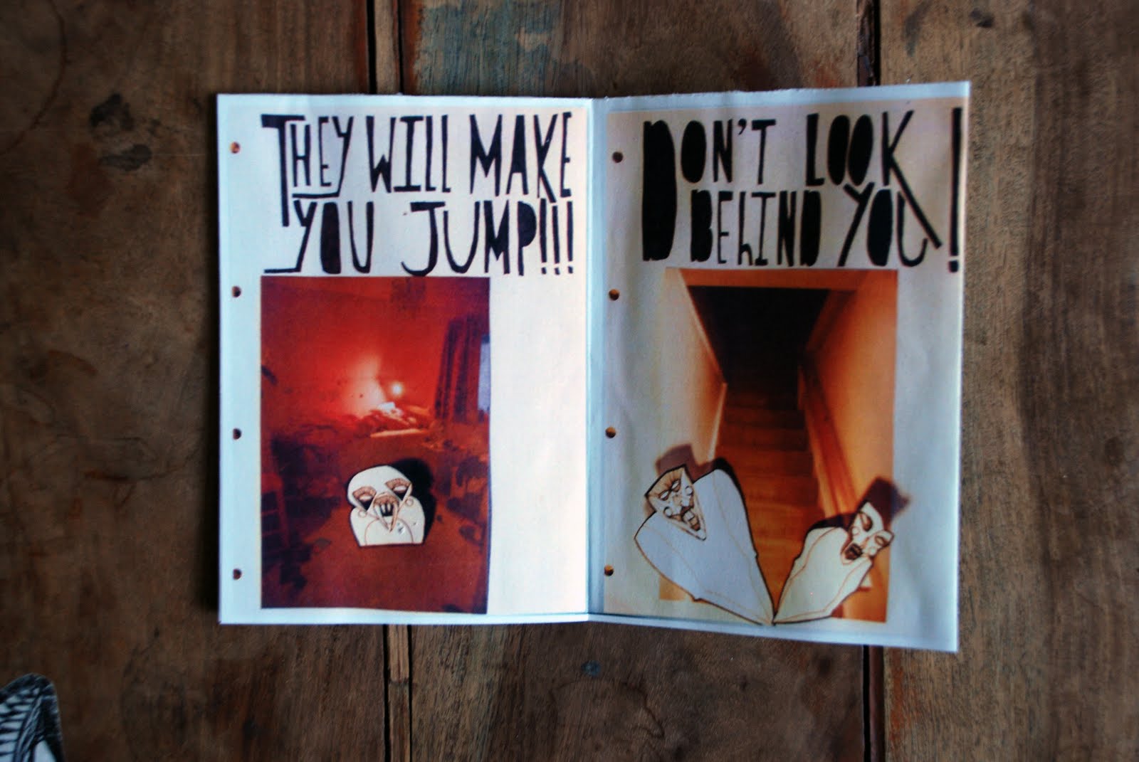
Main factors of this zine are that it is quirky, funny and dark.
Target audience is young people but also older ones who still remember what it was like to be a kid.

Final Zine- black and white

I decided to base my zine on childhood fears.
The location photography was round the home of places where children would be scared monsters would be waiting, or popping up.
This is my black and white copy.
This zine was very successful.
How i created the images was by a kind of collage.
I used the photographs i took and i also drew the monsters and the text.
the monsters i drew and cut out and placed in the photographs by hand by cutting up the photographs also.
i ended up using the images i photographed instead of scanned because the photographs had more shadow in them, which made it look more 3d like the monsters were coming out of their hiding places.

The font on the front and back i made by hand.
the monoprint i made of the monsters i made into a large pattern and cut the letters out of it and placed on black card.
Enjoy.

SEWING FOR HOUURRSSS!

with my new sewing machine.
thought i'd treat myself after allllll the work i did over easter.
but then again... i'd rather be paid with amaaazzzing grades then gifts
we'll see if it all pays off...

2AM SEWING!

soooooo NEARLY done!!
my back hurts!!!
just incase you're wondering,
here i was just sewing up my bunting.
i'm going to photograph it hung up somewhere tomorrow
and on photoshop use it in some more designs for greeting cards for 'BE HAPPY'
I realise it's a lot of effort to just make some font type for my greeting cards.
but i wanted the greeting cards, bunting and balloons to be part of my final piece.
and this way they all are.
I like the big progress i have made from just the idea of be happy and greeting cards.
the balloons and bunting helped me do this.
we'll see how they turn out.
excellent i hope.

Friday, 29 April 2011

Early experimentation/pages from sketchbook

Title for this blog says it all really.
Be Happy- The main idea for this project
Things to be happy for- Nature
This one is based on a quote i found about being happy-
HAPPINESS IS LIKE A KISS...
YOU MUST SHARE IT TO ENJOY IT.
This one is also based on a quote about happiness...
ALL THE HAPPINESS YOU EVER FIND LIES IN YOU!

These last two look like the lettering needs to be filled in black.
In my sketchbook it looks fine how it is.

Definitely final font!

Turned out even better than i thought.
I just need to make a sentence or word out of it.
Personally... i love it.
I think it sums me up completely.
Especially my work.
I hope you enjoy it as much as me.
target audience, people looking for something unique and out of the ordinary such as website and label designers
It would be used for where it is the main focus where the words are important and not the back ground and to stand on it's own.